Grid and Wall: How Brutalism Became a Visual Design System


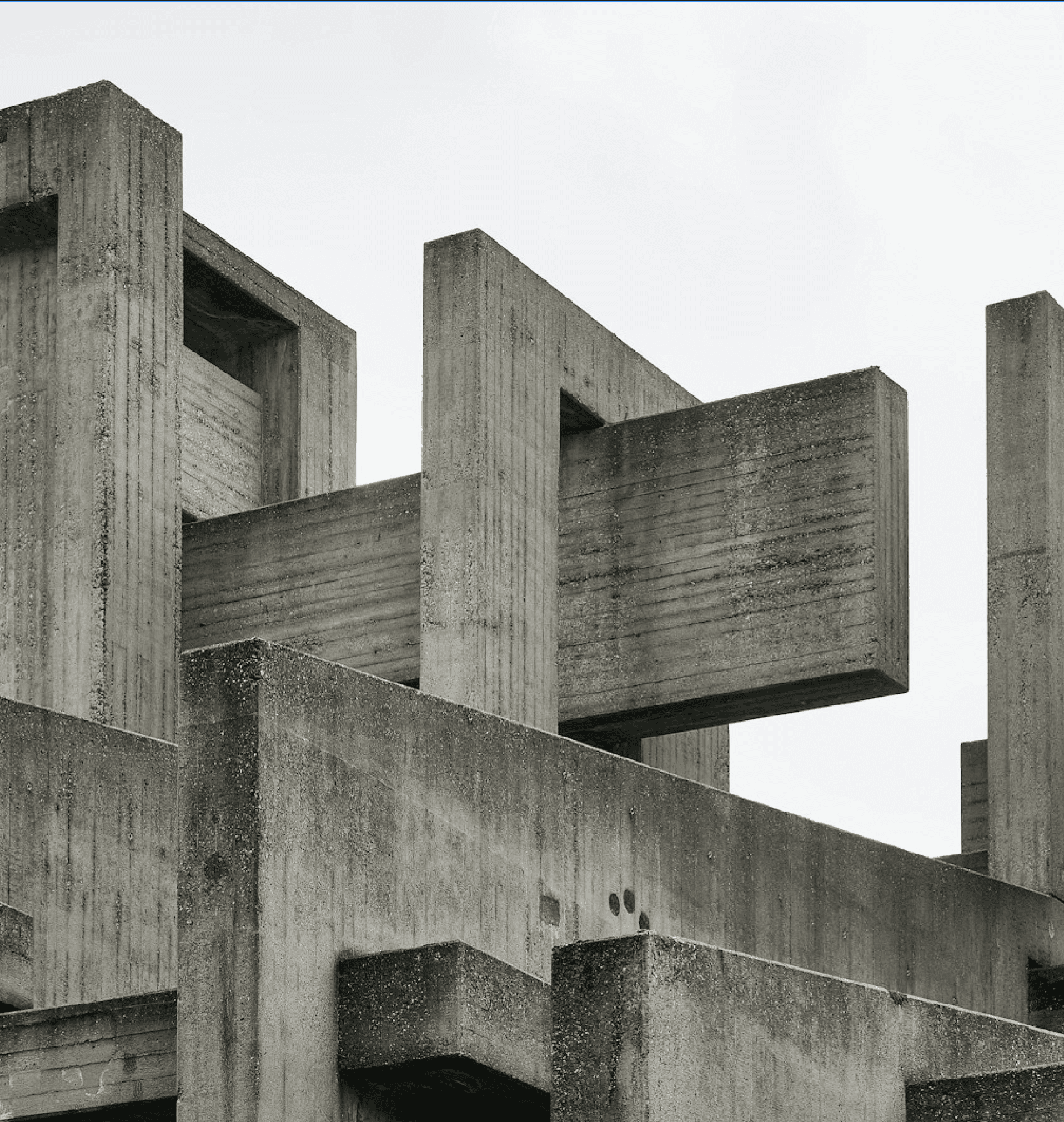
Like a concrete frame, a layout grid carries everything. It sets the rhythm that makes a complex page feel calm and navigable. Designers learned from architecture that a strong, visible structure can organise abundance without chaos. Columns, modules, and baselines behave like beams and slabs, holding content in disciplined order. The grid is brutalism translated into two dimensions.
Type plays the role of material. Heavy, plain typefaces carry the weight that raw concrete carries in a building. Brutalist design favours blunt, functional fonts over decorative ones, prizing presence over prettiness. Large, dense headlines mimic the mass of a façade, anchoring the eye the way a concrete wall anchors a street. Words become structural, not just informational.


The wall and the page turned out to share a surprising amount of DNA.
The grid is brutalism translated into two dimensions.

On the web, a whole movement of brutalist design has embraced raw HTML, stark layouts, and deliberate roughness. These sites strip away polish and ornament in favour of exposed structure, system fonts, and blunt edges. The style reacts against slick, identical templates, insisting that honesty can be a design value online too. Concrete's ethic of truth to material found a second home in code.
From printed page to glowing screen, brutalism's influence persists wherever designers value structure over decoration. Its lesson is that constraint and clarity can be beautiful, that showing the system is its own kind of style. The grid, the heavy type, the visible margin all trace back to a way of building in concrete. Brutalism taught designers a discipline, and gave them a way to make it look good.